Color is not just a physical phenomenon of electromagnetic radiation ricocheting around us. It is also a biological and chemical representation of that radiation in our brains. Cameras and screens are physical devices, so our image-editing software has to bridge that gap. One important gap to bridge is white point.
Why White Point Matters
An image's white point arises from a trick that our brains play on us: colors look the same in our minds regardless of the color of the ambient light. A red apple looks like the same red whether you see it under the blue of a sunny day or the yellow of a fire. Cameras must account for this trick to reproduce what we see.
In photography, a white point is the color that appears white—the color of the ambient light. A camera can calibrate to a white point that removes the artistic lighting you intended, so image editors let you adjust it afterward. Moving the white point is how you make an image feel warmer or cooler.
Why a Color Has a Temperature
We typically describe a white point with a temperature. How can a color be a temperature? It is a stand-in for a physics concept: color temperature is the color of a blackbody when heated. Think of iron glowing orange when pulled from a forge. This physics concept is a good approximation of the colors of light sources we see in the natural world, which is why a white point is typically defined by a temperature.
The Kelvin scale uses Celsius-sized degrees, with 0 K set at absolute zero: -273.15 °C (-459.67 °F). One unfortunate point of confusion in the color-temperature metaphor is that cooler colors, such as blues, have a higher temperature than warmer ones, such as oranges and yellows.
The color illustrations below were generated with BrushCue's Blackbody notebook.
| Color | Light source | Temperature |
|---|---|---|
 | Candle flame | 1900 K |
 | Sunrise / sunset | 2500 K |
 | Warm white LED | 2850 K |
 | Incandescent tungsten bulb | 3000 K |
 | Halogen lamp | 3200 K |
 | Neutral white LED | 4000 K |
 | Fluorescent office lighting | 4500 K |
 | Midday sunlight | 5500 K |
 | Electronic flash / studio daylight | 5600 K |
 | Overcast daylight | 6500 K |
 | Blue sky / open shade | 8000 K |
How Changing the White Point Changes an Image
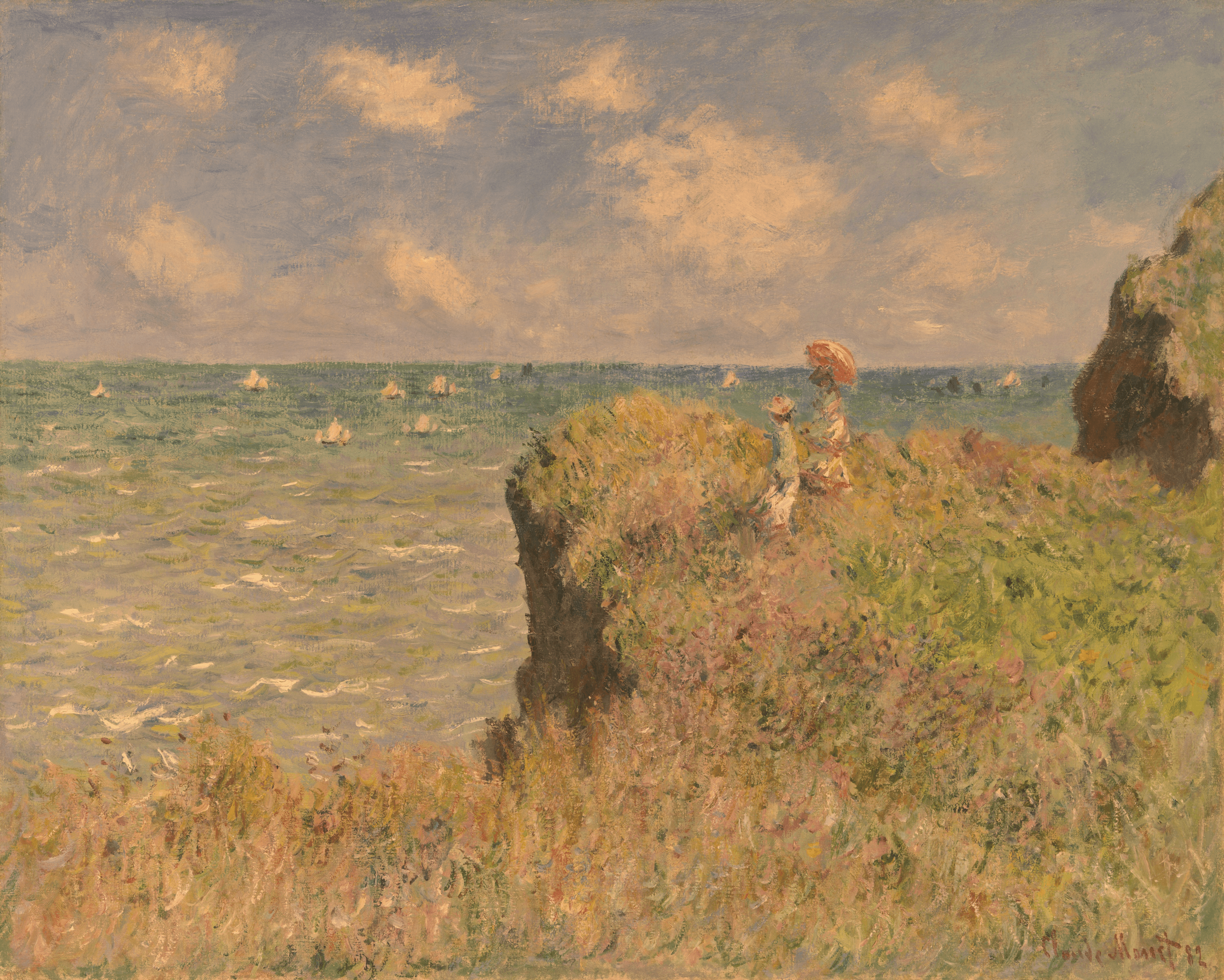
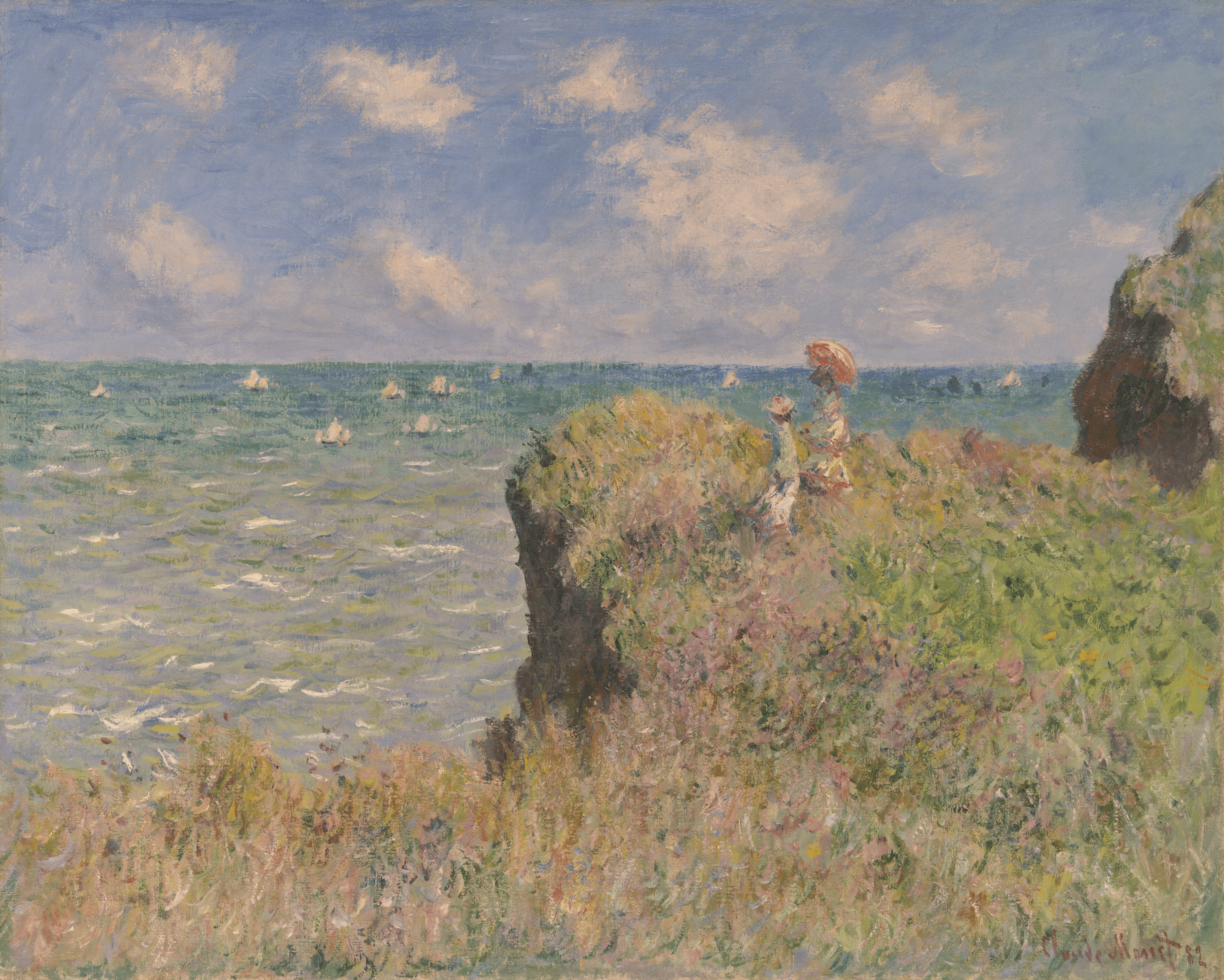
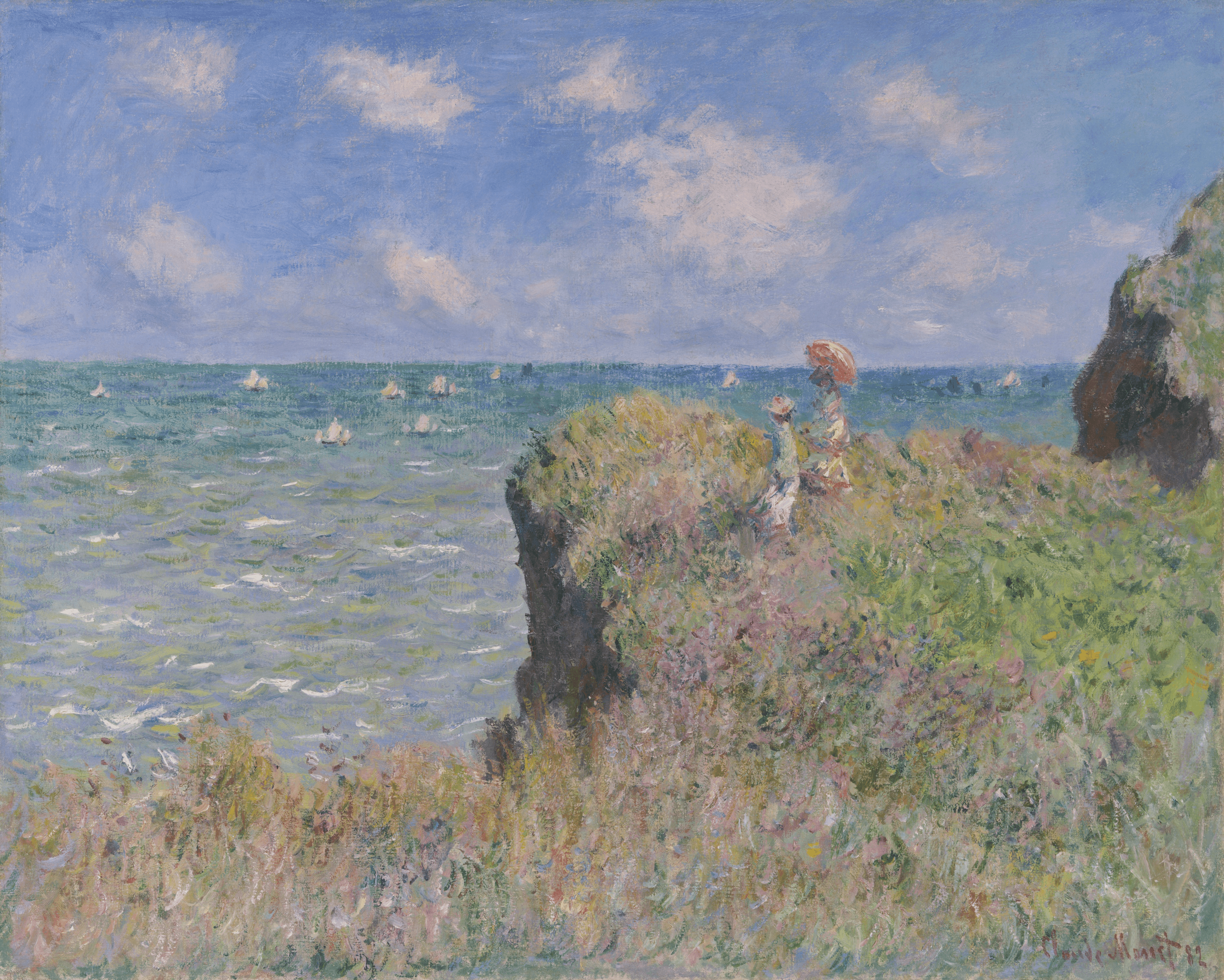
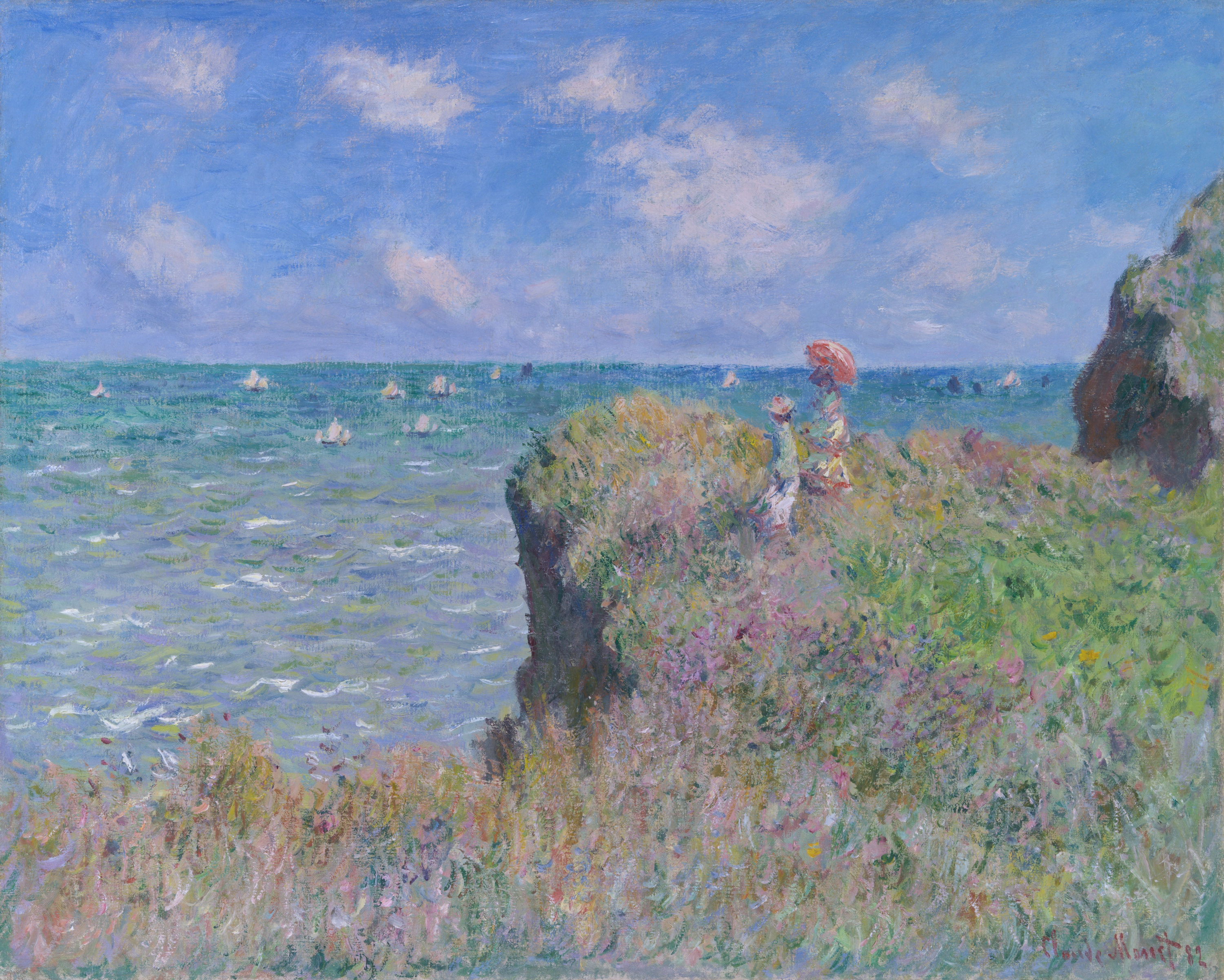
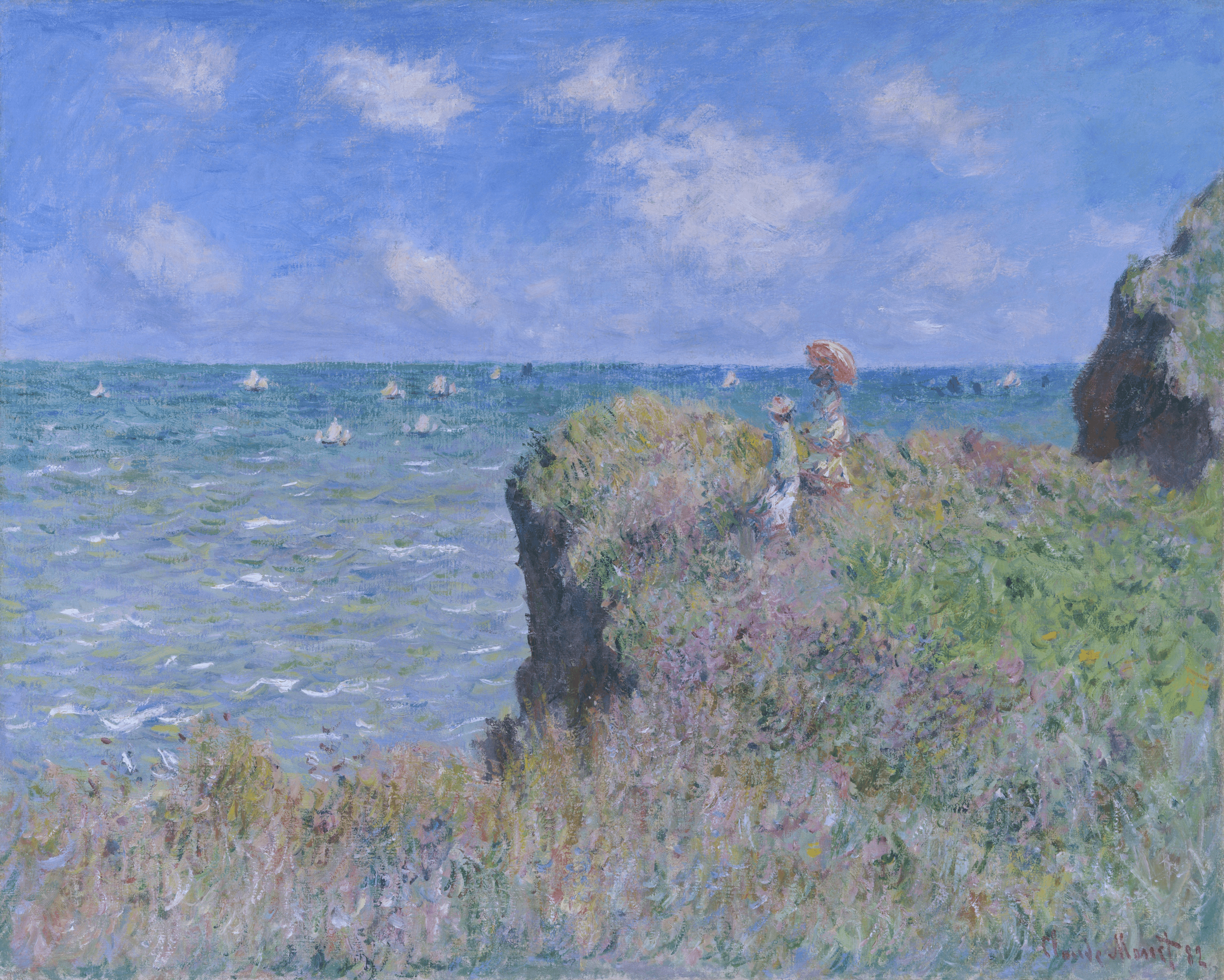
BrushCue uses D50 (5003 K) as its reference white point for editing. Lower Kelvin white points make an image appear cooler, while higher values make it appear warmer. The examples below show the same image with the white point changed across that range.
Try It in BrushCue and Python
In BrushCue's node editor, use Profiled Color Blackbody to generate the color of a blackbody at a chosen Kelvin value. The corresponding Python API method is ProfiledColor.blackbody(kelvin). The Blackbody notebook walks through those colors across the same range of temperatures shown above.
To retarget an image's white point, use the Composition Target White Kelvin node or the Python Composition.target_white_kelvin method. The Kelvin Tuner notebook shows the precise Kelvin workflow, while the Temperature Adjust notebook shows the warmer-or-cooler adjustment. You can find the full BrushCue Python API reference for these and other composable image-processing nodes.
Image source: Claude Monet, Cliff Walk at Pourville, 1882. Art Institute of Chicago, Mr. and Mrs. Lewis Larned Coburn Memorial Collection, 1933.443. Public-domain source image from the Art Institute of Chicago.
If the camera chose the wrong white point, use the Kelvin Tuner to correct it. If you are shaping the feeling of an image instead, use Temperature Adjust to quickly move it toward warm or cool.