Our new Artist-Inspired Filters collection brings ten different approaches to color, light, and atmosphere to your photos. Each filter takes a cue from a historical artist and develops it into its own treatment, from Rembrandt-inspired shadows to the blues of Hokusai’s prints.
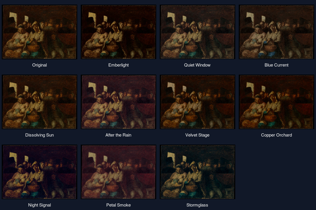
Choose a look, upload an image, and adjust the Strength slider. Start around the middle for a restrained treatment, or turn it up to explore the full palette. At zero, you return to the original appearance.
Emberlight
Emberlight draws inspiration from Rembrandt. It warms areas that are already illuminated while letting lower midtones recede into rich brown shadows. Try it on a portrait with light from one side or a room lit by a small lamp. The contrast comes from the light in your image, so a strongly lit subject gives it more to work with.
Quiet Window
For a gentler interior, try Quiet Window. Inspired by Johannes Vermeer, it balances cool shadows and clear blues against pale ivory highlights. Fine details remain visible, giving daylight portraits, ceramics, and tabletop arrangements a calm finish.
Blue Current
Blue Current takes its direction from Katsushika Hokusai’s woodblock prints. Blues and teals move toward Prussian blue, bright areas acquire a light paper tone, and small tonal variations become simpler. Coastlines, mountain silhouettes, and architectural shapes are good starting points.
Dissolving Sun
Inspired by J. M. W. Turner, Dissolving Sun lets bright regions soften into golden mist. Broad diffusion works through existing light while darker foreground shapes stay readable. Try backlit water, hazy hills, or a bright sky behind a silhouette.
After the Rain
After the Rain borrows its garden palette from Claude Monet. Greens soften, shadows lean violet, and pink accents gain a little separation. Colorful regions receive selective smoothing, making foliage and reflections useful subjects without softening every part of the picture equally.
Velvet Stage
Warm skin, dusty rose, charcoal accents, and a trace of directional pastel texture define Velvet Stage. Inspired by Edgar Degas, it restrains background color and softens transitions within nearby colors while holding stronger contours. Try indoor portraits, rehearsal photographs, or figures caught in motion.
Copper Orchard
Copper Orchard takes inspiration from Paul Cézanne’s still lifes and landscapes. It gives midtones more weight, brings out earthy reds, and separates them from cooler greens. Its detail treatment consolidates similar colors into firmer areas, particularly in fruit, buildings, and hillsides.
Night Signal
Inspired by Vincent van Gogh, Night Signal sets concentrated yellow light against deep blue shadows. A restrained local contrast boost helps existing shapes stand out. Try an evening street with illuminated windows or a room with a warm lamp.
Petal Smoke
Petal Smoke draws on the dreamlike color of Odilon Redon’s pastels. Dark tones lift toward lavender, pinks become more expressive, and saturated neighborhoods diffuse softly. Flowers and close-ups give its floating color room to develop; lower strengths also work for a gentle portrait treatment.
Stormglass
For a more charged atmosphere, Stormglass pairs blue-green shadows with crimson accents and silver light. Inspired by El Greco, it strengthens tonal contrast and gives existing bright edges a narrow lift. Try cloud formations, stone buildings, or a portrait with dramatic lighting.
Find a starting point
For portraits, compare Emberlight’s deeper illumination with Quiet Window’s cooler balance. For landscapes, try Blue Current for clearer color regions, Dissolving Sun for broad atmospheric light, or Stormglass for stronger drama. Gardens and flowers are a good way to compare After the Rain and Petal Smoke.
The previews use historical artworks to demonstrate the changes in strength. On your own photos, the result depends on the colors, lighting, and detail already present. These treatments interpret selected qualities of each artist’s work while preserving your scene’s composition.